Practice golfers can also browse our range and simulator golf bags — Corporate branding on a golf stand bag in 2026 has moved beyond a single stitched logo toward a system: primary placement of the mark on the front panel, a secondary mark on the gusset or side for visibility as the bag is carried, on-brand fabric and trim colorways, and a method chosen for the fabric — embroidery or molded patches where durability matters, and heat transfer or woven labels where a waterproof panel must stay sealed. Executed well, branding becomes product; executed carelessly in bulk, it becomes an inconsistent reorder that erodes the very brand it was meant to promote.
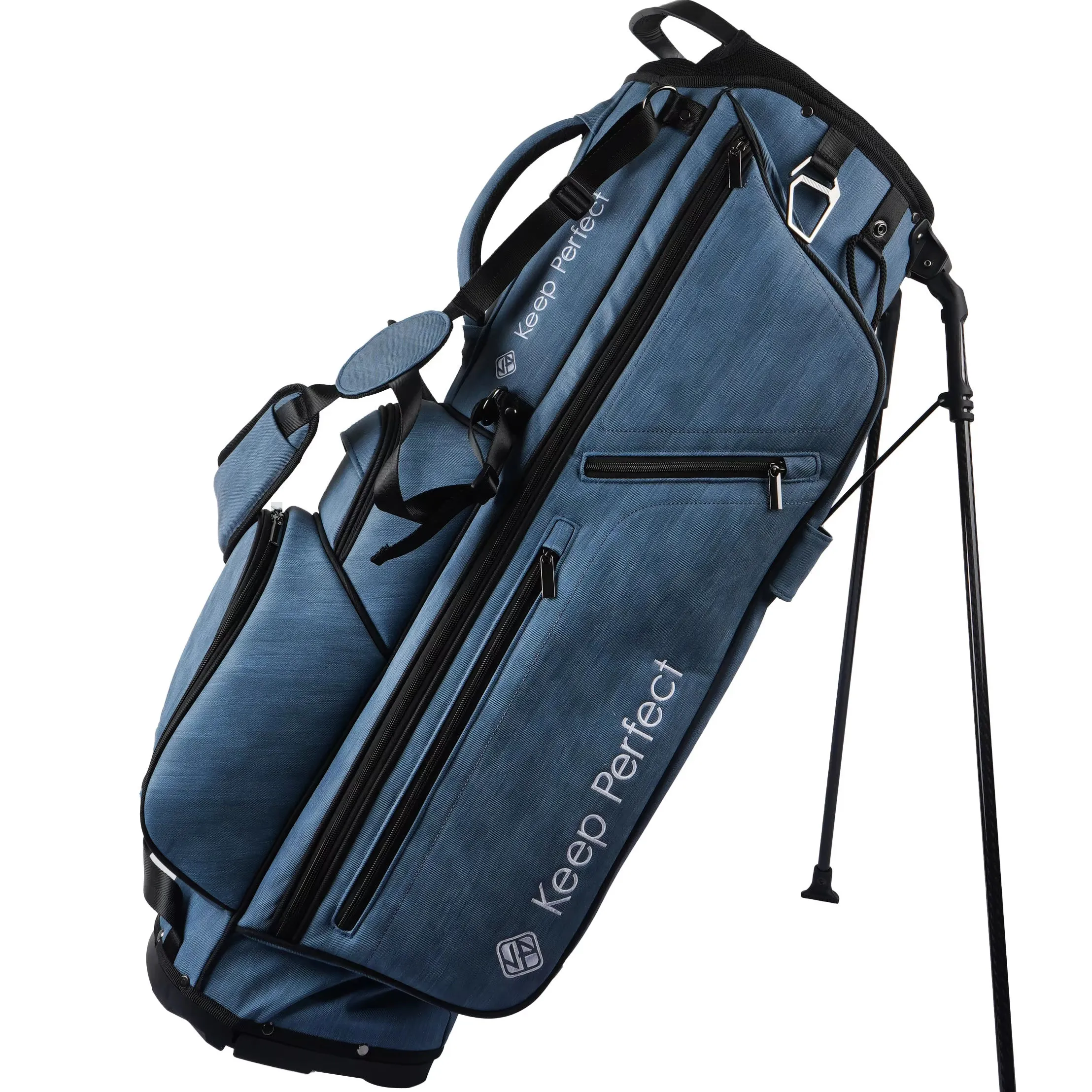
Branding as a system, not a single logo
The strongest corporate programs in 2026 treat the bag's branding as a coordinated system. A primary mark sits high on the front panel where it reads clearly as the player faces the bag; a secondary mark appears on the gusset or side so the brand is visible when the bag is being carried past other players; and smaller details — a woven label at the top handle, a subtle tonal logo on the ball pocket — reinforce without shouting. Each placement is chosen for how the bag is actually seen on the course.
Thinking of branding as a system also drives better production decisions. It tells the factory exactly where each mark goes, which method suits which panel, and how the marks relate to the structure and the seams. That spec clarity prevents the two problems that most hurt branded programs: marks placed where they wrinkle or wear awkwardly, and marks added as an afterthought over a construction detail. A brand that briefs placement deliberately gets a bag that looks considered from every angle.
Method choice: durability versus sealed waterproofing
The method choice is the technical heart of branding. Embroidery is the classic default because it is durable, dimensional, and reads as quality, and molded patches offer a clean, raised look that survives heavy use. Both are strong choices on standard fabric panels. The important nuance arrives with waterproof construction: dense embroidery penetrates the fabric with needle holes, which can compromise a sealed, waterproof panel, so the preferred methods there are heat transfer, a patch, or a woven label applied without piercing the waterproofing.
This is not a rule against embroidery on a waterproof bag — it is about where. A non-critical pocket or a trim panel can still carry embroidery, while the sealed front or top must use a non-piercing method to protect the waterproof claim. The right decision depends on the panel and the waterproofing scope, which is why the logo method and its placement must be on the tech pack together, matched to the fabric and construction, rather than decided independently.
Default methods compared
| Method | Best For | Durability | Waterproof Compatibility | Cost Position |
|---|---|---|---|---|
| Embroidery | Standard fabric panels | High | Use on non-sealed panels | Mid |
| Molded patch | Clean, raised identity | High | Good (applied to face) | Higher |
| Heat transfer | Waterproof / smooth panels | Good | Excellent (no pierce) | Lower-mid |
| Woven label | Small marks, handles | Good | Good (tacked edges) | Lower |
The table is a fast decision aid: pick the method by the panel and the durability asked for, and confirm it on the pre-production sample. Because the method affects both the look and the waterproofing, it should be locked at the swatch stage alongside the material, not deferred to bulk.
Colorways and on-brand fabric selection
The 2026 colorway trend is deliberate rather than garish: brands build their bag around one to three core colors that match the corporate palette, often as a main body color with a contrasting trim or gusset, rather than a loud all-over pattern. This keeps the bag professional and co-brandable while making it readable at a glance as a corporate product. The trim color, the zipper pullers, and the lining offer subtle places to repeat the brand identity without high cost.
On-brand color selection also has a production dimension. Because dyed materials can shift between lots, a program should source the body fabric from one solid run, set and share the approved color standard with the factory, and verify color online under consistent lighting against the sealed master before approving. This discipline is what keeps a corporate line looking identical across the season and across reorders — the single most visible measure of a professional brand program.
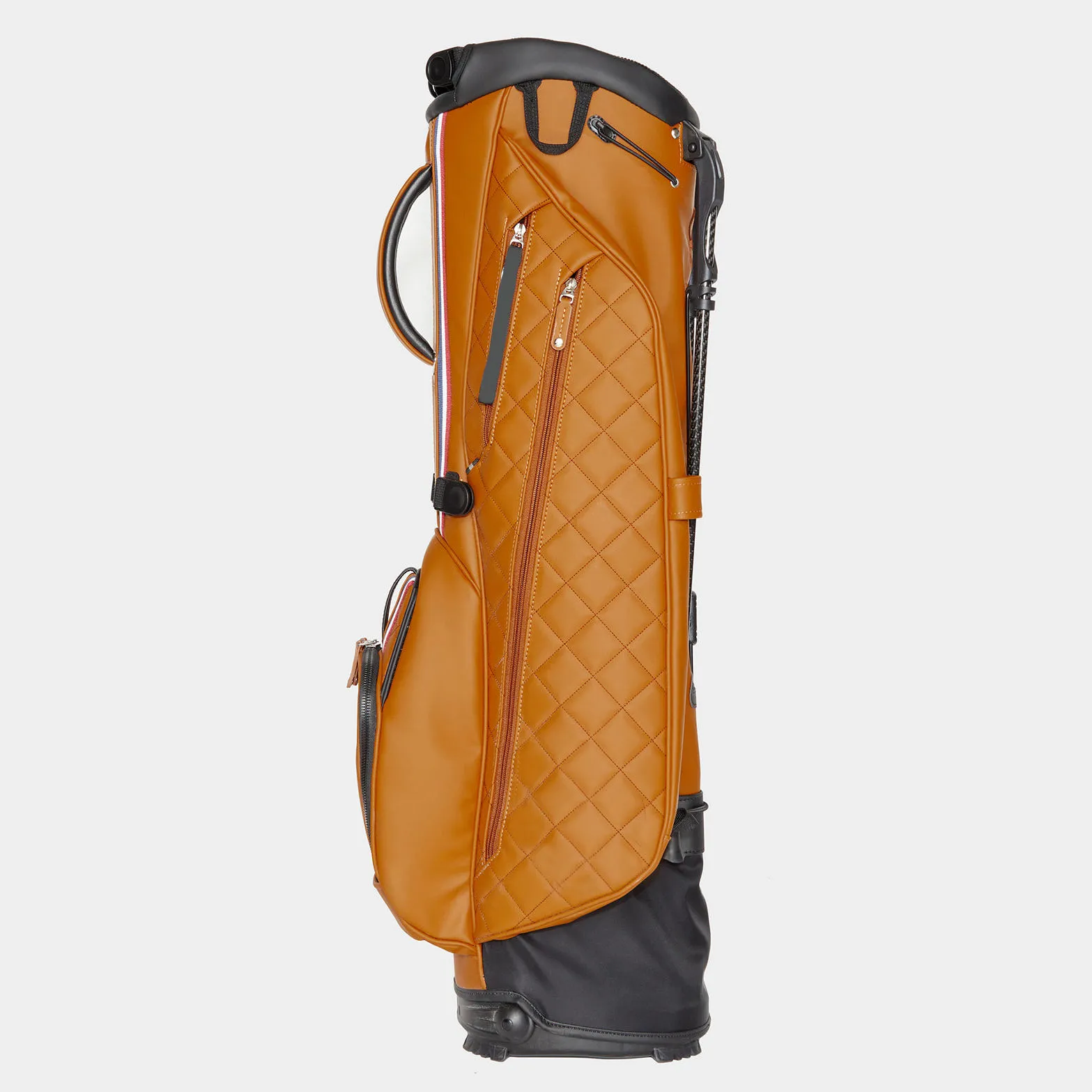
Placement strategy for maximum visibility
Placement strategy is where corporate branding earns or loses its visibility. The primary mark belongs on the front panel at roughly chest height, where it is the first thing seen face-on. A secondary mark on the side gusset catches the eye as the bag is carried and as the player moves, and a small mark near the top handle reinforces the identity without competing. Marks should sit on smooth panels away from zipper heads, seams, and high-flex stress points where they can wrinkle or wear quickly.
The other placement rule is proportion: the primary mark should occupy a confident but proportional area of the front panel, and everything else should stay visually subordinate. Over-branding a bag with a mark everywhere weakens the identity rather than strengthening it. The disciplined program picks a hero placement, repeats it consistently across the line, and lets the product's structure and quality carry the rest of the message.
A practical reference is to size the hero mark so it reads clearly from a few metres away — the distance a spectator or a fellow player stands — while keeping the smaller reinforcing marks legible up close. This two-distance logic is what makes a branded bag effective on the course, and it is worth writing down as a simple rule at the start of the tech pack so every placement bows to it.
Functional customizations that extend the branding story
Trends in 2026 also use functional customizations to reinforce the corporate identity, not just display it. A custom-cooler pocket for a beverage brand, a rangefinder pocket tailored to a tech sponsor, a generous apparel pocket for a clothing or corporate gifting program — these make the bag carry the brand's meaning in daily use rather than only in a logo. The customization becomes a reason the recipient reaches for the bag, which is exactly what a corporate give-away or sponsorship wants.
The functional layer must still respect the same manufacturing discipline as the logos: a pocket count and layout that fits the segment, a divider configuration matched to the buyer, and material and hardware that hold the QC standard. The brand story and the structure should be designed together and recorded in the tech pack, so the customized bag remains buildable and consistent in bulk. This is genuinely ODM territory, and it is the way we approach OEM/ODM custom programs.
A useful test for a functional brand story is simply: does the recipient use the feature every round, or only admire it once? A cooler pocket used for a drink on the walk, a rangefinder pocket that fits today's common devices, a valuables pocket that is genuinely easy to reach — those are the functional identities that keep a corporate bag in rotation and the brand in front of the recipient. Designing the feature around real daily use is what turns a branded give-away into an ongoing advertisement.
Consistency in bulk and reorders
The trademark of a mature corporate program is that the thousandth bag looks like the first. Achieving that requires locking the full picture at the PPS — the exact logo placement and size, the exact thread and fabric colors, the exact trims — and then holding a sealed master so every reorder is matched against it. Inline QC checks the marks, the color, and the placements at defined checkpoints, and the banding, labels, and packaging stay standardized so the brand experience is uniform end to end.
The practical consequence is that a corporate buyer should treat the sealed master as the single source of truth for the whole life of the style. Change a reorder spec and you re-open the risk; keep it identical and the line stays identical. This is why we recommend an AQL inspection and a retained master sample, and it is what keeps the brand looking premium across batches and seasons rather than drifting between lots.
Budgeting the branding work
Branding carries a real, quantifiable cost that a corporate buyer should budget consciously. The main levers are the number and size of marks, the method (embroidery and molded patches cost more than a woven label or basic heat transfer), the number of colors per mark, the logo setup and digitizing, and whether any mark sits on a waterproof panel that requires a non-piercing application. Dense embroidery on a large front panel with several thread colors, for example, is a meaningfully different line item than a single small woven label.
The smart approach is to set a branding budget band first, then choose placements and methods that fit it, in that order — because placement cost compounds. A primary hero mark plus a small secondary mark is usually the highest-return spend; adding a third mark or dense all-over branding spends more for lower marginal visibility. Briefing the budget band lets the factory cost and recommend within it, and it keeps the program profitable while it builds the brand.
How placement choices affect the sample
Everything about corporate branding should be confirmed on the sample before bulk, because rendering a logo on a curved fabric panel is different from a computer flat view. The pre-production sample shows the true scale, the stitch or print density, the color match against the fabric, and how the mark sits relative to the pockets and seams. Approving on a sample rather than on screenware is the only reliable way to avoid the classic disappointment of a mark that looked right in the mock-up but crowds the panel in reality.
The sample also validates the method on the real fabric: whether embroidery stays flat, whether a heat transfer adheres cleanly, whether a patch stays tight to the curve. Request the branded sample specifically — not just the blank bag — and run the colorfastness and adhesion checks on it. That single discipline removes most of the risk in a branded program and is why every corporate order we take goes through a branding-verified pre-production sample before any bulk commitment.
Emerging corporate branding trends for 2026
Several measurable trends are shaping corporate stand bag programs in 2026. The first is purposeful minimalism: instead of loud multi-plecement branding, companies choose one confident hero mark and repeat it cleanly, letting the bag's color and structure do the talking. The second is co-branding readiness — a bag designed so two marks (for example, a corporate sponsor and a tournament or partner) sit in defined, interchangeable positions, which lets one base structure serve multiple campaigns without redesign.
The third trend is sustainability-conscious branding, where a brand uses recycled materials or verified eco claims as part of the corporate message, pairing the logo with a recycled-content story on the label. The fourth is tech-driven placement, where the badge and the tech pockets are designed together so a rangefinder or cooler pocket carries the sponsor's identity functionally, not just visibly. Together these move corporate branding from decoration toward integrated design.
Trend: co-branding and interchangeable placements
Co-branding is one of the fastest-growing patterns because it lets one bag compound the value of several relationships. A single SKU can carry a corporate logo in the primary position and a tournament, league, or partner mark in a secondary position, both in defined panels that are designed to receive a mark. Because the placements are fixed and tested, swapping the secondary mark between campaigns does not disturb the construction or the waterproofing.
The production benefit is real inventory flexibility: a base bag with modular placements can be finished for different programs from a shared body, reducing the distinct SKUs you hold while serving multiple partners. The discipline is to standardize the mark sizes and panel locations up front, document them in the tech pack, and confirm each variation on a sample before bulk. Used well, co-branding turns the same bag into a flexible corporate asset.
Trend: clarity in the label and compliance story
Corporate programs increasingly use the bag's labeling to tell a clear, compliant story. A concise label carries the brand, the fiber content, the country of origin, the care instructions, and any genuine sustainability claim with its certification reference, keeping it truthful and ready for the buyer's market. For export to the EU or US, this clarity is not optional — it is the basis of smooth import and retail acceptance, and it should be defined before bulk rather than patched at the border.
Because labeling rules vary by destination, a professional program flags the target market early and aligns the label language and fields to it. This is one of the least glamorous but most important parts of corporate branding: no logo earns trust if the shipment is delayed or refused on labeling. A factory that can confirm the label requirements for your market is a genuine partner, and we detail these in our EU and US labeling guide.
Protecting the logo through the product's life
A logo is only an asset while it still looks good, so part of corporate branding is designing the mark to survive the product's working life. That means choosing a method matched to the panel, keeping marks off wear-prone flex and abrasion points, and confirming during testing that the embroidery, patch, or transfer holds color, shape, and adhesion under realistic use. A fading or peeling logo does more harm than no logo, because it reads as poor quality to every player who sees it over the bag's life.
For a corporate buyer, this translates into a specific request: add a wash, abrasion, and colorfastness check on the branded sample before approving bulk. It is inexpensive to run, and it catches the failure class that would otherwise surface as a branded bag that loses its mark mid-season. Planning the life of the logo at the sample stage is the difference between a premium-looking program and one that quietly degrades.
How consistency is achieved across the whole line
A branded line stays consistent not by coincidence but by a deliberately shared spec. Use the same divider system, the same stand platform, the same zipper and strap standard, and the same color discipline across the SKUs, then vary only the colorway and the logo placement. This keeps the manufacturing simple and the QC checklist stable, and it gives the line a recognizable family look that strengthens the brand far more than a set of unrelated bags would.
The shared-spec approach also cuts cost and lead time, because a factory can plan common components and reorder them efficiently, and it makes catch-a-defect easier since one standard applies. For a corporate program selling into retail or gifting, the result is a coherent range where every bag carries the same quality feel and the same brand voice — the strongest possible advertisement for the company that commissioned it.
Questions a corporate buyer should ask the factory
Before committing to a branded program, ask a handful of pointed questions. Does the factory lock the logo placement and method on the pre-production sample, and for waterproof bags will it confirm the method does not compromise the seal? Does it manage color consistency against a sealed master and offer repeatable reorders that match? Can it confirm the label and compliance fields for your target market? Does it hold the QC equipment for the tests you want, and does it retain a sealed master for the life of the style?
Good answers separate a factory that handles corporate branding seriously from one that treats it as an extra. Corporate programs live or die on repeatable detail — the mark, the color, the placement, the compliance story — and the right factory is the one that can hold all of it constant. These are the standards we hold on our factory & QC pages and the ones we bring to every OEM/ODM program.
Building your branded bag: the briefing
To start a corporate branded program cleanly, assemble a one-page brief: the target market and price position, the bag type, the material direction and any waterproof scope, the divider and pocket list, the logo art with exact placements and sizes and the preferred method, your brand color standards, the QC tests you want, and target MOQ and timing. Send it with reference photos to service@junyuanbags.com or +86 17750020688, and we will return a plan and a pre-production sample in 10-20 days, with bulk in 45-60 days.
Corporate branding succeeds when the logo, the color, the method, and the structure are specified together and verified on the sample. Treat it as the system it is — branding plus construction plus manufacturing consistency — and the result is a bag that promotes your brand every round it travels.
FAQ
Which logo method is most durable on a stand bag?
Embroidery and molded patches are durable. For waterproof panels, heat transfer or patches may be preferred to avoid needle holes in sealed areas.
How should logos be placed for maximum visibility?
Put the primary mark on the front panel at chest height, add a second mark on the gusset or side, and keep small marks off high-flex stress points.
What is the most common corporate branding mistake in bulk production?
The most common mistake is color inconsistency — reorder batches that do not match the approved sample — which is prevented by color management and holding the sealed master for every reorder.
Should branding be placed on waterproof panels?
Use care: embroidery needle holes can weaken a sealed area, so on waterproof panels prefer heat transfer, a patch, or a woven label rather than dense stitching.
Do you support OEM/ODM for golf stand bags?
Yes. We support OEM (branding on proven architectures) and ODM (co-develop structure, pockets, materials, and hardware). Provide your target market and quantity to start.
What is the fastest way to get an accurate quote for a branded bag?
Send bag type, material direction, divider, pocket list, logo art and placements, target MOQ, timeline, and reference photos or a tech pack.
Recommended Internal Links
Request a B2B quote for golf stand bags
Send your target market, expected MOQ, and reference photos. We respond within 24 hours with a sampling plan.