For a featherweight minimal carry, explore our Sunday bags — Practice golfers can also browse our range and simulator golf bags — Designing a golf stand bag that represents your brand identity starts with locking a color system, a logo lockup, and a silhouette to 4-6 consistent brand cues, then applying them across the shell, panels, and trims so the bag reads as your brand from a thumbnail to the course. This guide walks a B2B buyer through the process at our affiliated Quanzhou factory (SGS-verified, 4,950 sqm, 7 lines, 149 machines, 137 staff) from identity workshop to sealed sample.
Why a Stand Bag Is a Brand Canvas
A golf stand bag is one of the few branded products that travels with its owner, appears in every course photo and retail frame, and holds a place in a golfer's daily routine for a season or longer. That makes it a higher-frequency brand surface than a hat or a towel: it is seen at the bag drop, on the cart, leaning by a tee, and in dozens of tournament photographs. For a brand launching a bag line, or a company gifting stand bags, the product is effectively a moving billboard that must read as the brand even when the logo is small. Consistency across color, font, and silhouette is what makes that reading instant, and inconsistency is what makes a premium product feel generic.
The design therefore begins with the brand, not the bag. Before a panel is cut, the identity team should fix the brand cues the bag will carry: a primary color or a two-tone scheme, the logo lockup and its placement, a typography style for any secondary text, and a silhouette or detailing cue that is distinctive to the line. Locking those cues once, in a short design brief, prevents the drift that happens when a buyer and factory "iterate toward" a design across many emails. A documented identity basis is what lets the manufacturing team execute a coherent bag rather than interpret a vague instruction.
Start With an Identity Workshop and Design Brief
The most efficient way to turn a brand into a bag is a short structured brief before any sampling. Gather the brand palette (Hex or Pantone), the logo files in vector and the lockup rules, two or three reference photos of bags or graphics the brand admires, and a one-line description of the positioning — technical, premium, sustainable, bold, minimalist. From those four inputs we draft a design that maps color to the main panels, places the logo in the hero zone, and defines the trims. The brief also fixes what the bag must not do: showcase colors the brand does not use, carry typefaces outside its system, or imitate a competitor's silhouette too closely.
The workshop output is a short design sheet that becomes the contract for the sample: the shell colors with PMS references, the accent and lining colors, the logo placement with measurements, the trim color, and the graphics zones. This sheet keeps every later decision — a zipper pull color, a badge, a stitch accent — consistent with the identity. It also makes quoting faster, because the factory knows the materials and placements before costing. A brief this disciplined rarely wastes a sample round, and it is the single factor that most separates a bag that looks like the brand from one that merely carries its logo.
Color System: Choosing and Locking Your Palette
Color does most of the identity work on a bag, and it is the element buyers most often underestimate. Start with one primary shell color that is unmistakably yours, one accent that appears in small, deliberate touches (zippers, piping, a badge), and a neutral lining. Keep the total system to two or three colors so the bag stays cohesive and the cost stays controlled, because each shell color and its trims carry material and patterning implications. Confirm the chosen colors as Pantone references on the actual fabric, not on screen — nylon, polyester, and PU each read a color differently, and what looked right in the mockup can look wrong in the sunlight.
Test the palette at the two extremes where the bag is seen: the compressed thumbnail and the bag across a cart lane. A light shell with a dark logo and a single bold accent reads well in both, while a busy multi-color graphic can collapse into noise at thumbnail size. Consider how a palette will look across a full product range — a flagship bag, a lightweight carry variant, and an accessory — and pick colors that extend into all of them. Lock the palette in the design brief, provide PMS references, and require the factory to approve a color chip on the real material before the shell is cut, so the identity is consistent from the first sample to the last production unit.
Logo Placement and the Hero Zone
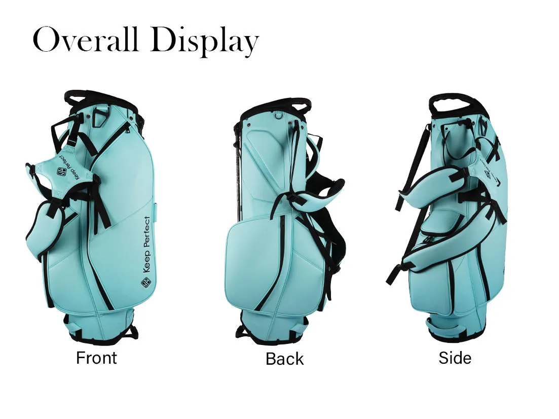
Where the logo sits decides how often the brand reads. The front lower panel is the hero zone on a stand bag — it is the face in every thumbnail and retail shot, and it is what a golfer sees behind them and in a cart. Place the primary logo there in the agreed lockup. The top lid is the second impression, appearing in the second scroll of photos and on the course; it often carries a secondary or tonal version of the mark. The side panels give room for a larger or more adventurous logo treatment on a bigger bag, and the valuables pocket is a discreet fourth zone for a small mark or monogram. Choose the zones before production and fix them with coordinates in the tech pack so the lockup aligns on every unit.
Logo error is the costliest error to fix late, so protect the artwork. Send vector AI/EPS with fonts outlined, colors separated by Pantone, and a min-size guide so no placement forces the logo too small to reproduce cleanly. Confirm the lockup reads on the hero panel's actual fabric — thread and print behave differently across nylon, polyester, and PU, and a logo that looked fine in the mockup can blur or flatten in production. Pair the logo placement with the claimed product features so the branding and the function support each other, and approve a production-material sample before any bulk so the hero zone is locked correctly the first time.
Silhouette and Detailing Signs That Carry Identity
Beyond color and logo, the silhouette and its details are how a bag becomes recognizable even from a distance or with the logo cropped out. Distinctive cues can be a signature top handle, a specific lid shape, an angled pocket line, a contrasting stitch or piping band, a badge or welded marker on the valuables pocket, and a trim color that traces the base. Pick two or three signature cues and repeat them consistently rather than loading the bag with novelty — a signature is a repeatable element a customer learns to associate with you, not a one-off flourish. These cues also give a product line a family look across sizes and price points, so a consumer recognizes that the flagship and the lightweight variant are the same brand.
Detailing cues are where OEM and ODM diverge. In an OEM program the factory produces your established architecture and your finish details, which is fast and low-risk. In an ODM program we co-develop the silhouette and its signature cues with you, turning a brand sketch into a pattern, a hardware set, and a trim scheme that are manufacturable at scale. Because the cues touch structure — a lid shape affects patterns, a piping band affects sewing sequences — deciding them with the factory avoids a design that cannot be produced cleanly. A bag that reads as your brand through its silhouette, not just its badge, is the real payoff of intentional detail design.
Brand Identity Design Specification Table
Lock these rows on the pre-production sample, following the standards at QUANZHOU JUNYUAN BAGS.
| Element | Spec | Why It Matters |
|---|---|---|
| Palette | 2-3 colors, PMS-referenced | Keeps the bag cohesive and recognizable. |
| Logo file | Vector AI/EPS, outlined, non-text | Required for clean reproduction. |
| Hero zone | Front lower panel, fixed coordinates | The face in every thumbnail and retail shot. |
| Accent trims | Zipper, piping, badge color locked | Signature cue that survives logo crop. |
| Secondary logo | Tonal version on the lid | Second impression without clutter. |
| Color check | Chip on real material, not screen | Fabric shifts the read of every color. |
| Sampling / bulk | 10-20 days sample; 45-60 days bulk | MOQ 200 pcs, test order 100 pcs. |
Sustainability as an Identity Driver
For many modern brands, sustainability is not a feature but the identity itself, and the stand bag becomes the vehicle for the story. Supply-chain transparency, recycled or lower-impact materials, and a clear communication of both become the brand cues. At our affiliated plant, a buyer can specify recycled fabrics for the shell and lining, low-impact dyeing, and a documented material chain that lets the brand tell a verifiable sustainability story to its customers — which is exactly the sort of cue that differentiates the product in a crowded market. Because sustainability claims must be credible, a factory that can actually produce and document them matters more than the label on a market bag.
Frame sustainability in the design brief as part of the identity. Confirm which materials carry the story, how the story is told on the product (a logo badge, a hang tag, a stitched message, a QR panel), and what documentation the brand needs for its own marketing. A durable, repairable, recyclable bag is also a better long-term advertisement than a cheap one that degrades, because an owner keeps and uses a bag that performs and shows the brand longer. Positioning sustainability as an identity driver — not a compliance checkbox — turns the stand bag into proof of the brand's values rather than just a carrier of its logo.
Combining Identity With Function (Pockets, Dividers, Structure)
Identity and function must be designed together, because a bag that looks right but fails on the course undermines the brand more than a plain one does. The golfer instantly feels strap comfort, the divider layout, the stand stability, and pocket access, and that feeling transfers to the brand. So the design should map the identity cues onto a structurally sound architecture: color and graphics live on the flat panels and the lid, while the stand, the straps, the base, and the hinge stay technically proven. A premium-looking bag that does not hold a stand or organize clubs properly reads as a fake, not a premium product.
A common architecture pattern is a four-way divider for lighter carry or an eight-way "lab" layout for full sets, a two-strap system for weight distribution, and a stable stand with a case hinge. Place the identity on that proven core so the branding supports, never compromises, the behavior. If the identity calls for a feature the architecture does not yet have — a magnetic rangefinder pocket, a removable valuables sleeve, a padded spine — decide in ODM mode where it sits and how it is costed. Locking identity and function in the same sample round is the difference between a bag that photographs well and one that earns repeat ownership and word-of-mouth.
From Sample to Line: Keeping the Brand Consistent at Scale
The identity is only as strong as its consistency across a whole production run. A sealed master — a frozen reference bag carrying the approved color chips, logo placement, trim, and finish — becomes the QC baseline that every unit in every run matches. We hold a first-article inspection on the run's first unit, check color against the sealed chips, logo position against the drawing's tolerance, and trims against the reference, then spot-check through the order. For a brand scaling from a test order to a multi-market season, this discipline keeps each batch identical to the last, so the customer's recognition of the brand never dilutes between orders.
Consistency also extends to your marketing materials. Because every production bag matches the sealed sample, your product photos, e-commerce images, and unboxing content all show the same product the customer receives, which protects the brand promise. We supply a sample set and documentation that lets your team photograph and promote the bag in advance of the bulk arrival, so the launch and the shipment align. When the color, logo, and silhouette stay locked from sample to season, the stand bag does its real job — carrying your identity to every course — reliably, and the brand investment compounds into recognition.
Materials That Strengthen the Identity
The materials a bag is made from carry the brand as much as the artwork does, and choosing them consciously makes the identity feel real rather than superficial. Nylon in different deniers reads differently: a heavier 600-840D shell signals durability and technical construction, while a lighter 200-400D shell signals a minimalist, featherweight, "carry-all-day" brand. Polyester gives a smoother, glossier, more colour-saturated finish that suits vibrant or lifestyle identities, and PU or vinyl surfaces convey modern technical or premium sealed construction suited to a waterproof proposition. Lining, trims, hardware, and zipper pulls are smaller cues that add up: an anti-snag nylon liner, a matte vs. gloss hardware, and a branded zipper pull each reinforce the tone.
Match the material story to the brand message deliberately. A sustainability-led brand wants recycled fabrics and a verifiable supply chain documented for its story; a premium gifting brand wants a dense, supple shell and polished hardware; a bold technical brand wants high-denier nylon and a secure waterproof face. Because each material has cost, weight, and manufacturing implications, deciding the material identity in the design brief — before quoting and patterning — avoids a costly mid-project shift. At QUANZHOU JUNYUAN BAGS we advise on actual fabric options and produce a swatch with the sample so the brand's material promise and its logo land together on one cohesive bag.
Key Takeaways
- Lock 4-6 brand cues — palette, logo, typography, silhouette — before sampling.
- Use a 2-3 color PMS-referenced system and confirm chips on real fabric.
- Place the hero logo on the front panel with a tonal lid repeat.
- Add 2-3 repeatable signature details so the bag reads as your brand even without the logo.
- Keep identity consistent with a sealed master and first-article QC at scale.
Pricing Your Brand-Identity Program Realistically
A clear cost model keeps a branded program from overruns. The main drivers are the shell material and its weight, the number of colorways and trims, the logo method and its complexity, and the quantity. Embroidery and heat transfer add a small per-unit cost plus a one-time setup, while a woven label or a tonal mark is lower. The custom structure, if the identity calls for a new silhouette or feature, carries the ODM engineering cost. Because setup is amortized across the run, the per-unit price falls as quantity rises, so model the number of SKUs and the total volume together rather than pricing one bag in isolation.
Ask for a quotation that separates the setup, the per-unit production, the sampling, and the shipping so the budget is transparent, and lock the sealed master to make reorders skip re-setup. For a range, standardizing trims and logo methods across SKUs lowers cost and strengthens the family look. If your line will relaunch each season, a stable architecture with refreshed color cues is cheaper than a new construction every time, because the tooling and techniques persist while the identity stays fresh. That balance of fresh color and stable structure is what keeps brand identity premium and the program affordable across seasons.
Test Plan & Acceptance Criteria
Add measurable checks to keep the identity accurate and consistent against the brief.
- Color check of every panel and trim against the PMS-sealed chips.
- Logo placement and size check within +/-2 mm on the hero zone.
- Logo reproduction check on the actual production fabric.
- Silhouette and signature-cue check against the design sheet.
- First-article record and unit-to-sample consistency across the run.
- Function verification: stand, strap, dividers, and pockets still pass.
Recommended Internal Links
- Products (Stand Bag Architectures)
- OEM/ODM Service
- Factory & QC
- Golf Stand Bag Buying Guide
- Creative Logo Ideas
- Incorporate Your Slogan
FAQ
How do I design a custom golf stand bag that represents my brand?
Start with a short design brief that locks a 2-3 color palette, the logo lockup, a typography style, and a silhouette with 2-3 signature cues. Confirm color chips on real fabric and approve a production-material sample before bulk.
What colors should I choose for a branded stand bag?
Choose one primary shell color, one accent for trims and zippers, and a neutral lining — a total of two or three colors. Use Pantone references and verify the chips on the actual nylon, polyester, or PU before cutting.
Where should my logo go on a golf stand bag?
The front lower panel is the hero zone for the primary logo. The top lid carries a tonal secondary version, and the side panels or valuables pocket suit small marks. Fix each placement with coordinates in the tech pack.
What files do I need to provide for my logo?
A vector AI/EPS file with fonts outlined and colors separated by Pantone. Vector is required for clean reproduction at any size; a raster image will not cut or embroider reliably.
Can I combine branding with premium features?
Yes. Identity cues live on the flat panels and lid while the stand, straps, dividers, and pockets stay technically proven. If your identity needs a new feature, plan it in ODM mode so it is costed and engineered together.
How do I keep branding consistent across large orders?
Use a sealed master — a frozen reference bag with approved color chips, logo placement, and trims — as the QC baseline. Require first-article inspection and unit-to-sample checks through the entire run.
What is the MOQ and lead time for a branded stand bag?
Standard MOQ is 200 pcs with a 100 pcs test order. Sampling runs 10-20 days and bulk production 45-60 days. Share the design brief and artwork early to fit the sample window.
Request a B2B quote for golf stand bags
Send your target market, expected MOQ, and reference photos. We respond within 24 hours with a sampling plan.